In the previous post, I removed the contact-quality score from my Apple Watch hurling app. The score looked useful, but I could not explain what it really measured. So I kept the basic measurements and let the player rate each strike instead.
Since then, I have taken a simpler approach. I rebuilt how the Watch records motion. I also trained the model to recognise more types of strike and added tools for comparing practice sessions.
I also bought an Apple Watch Series 11.
The idea came from Apple’s WWDC 2023 session “What’s new in Core Motion”. Apple showed how a Watch could record acceleration 800 times per second and device motion 200 times per second. The example used those two streams to measure the time from the start of a baseball swing to impact.
That looked very close to the hurling problem I was working on. It made a newer Watch feel useful rather than simply nice to have.
My Series 6 worked well for the earlier experiments, but it could not record both high-speed streams. My first recordings were at 50 samples per second, followed by later sessions at 100. The Series 11 gave me far more detail around contact, but I still had to work out what that data meant.
Two Sensor Streams With Different Jobs
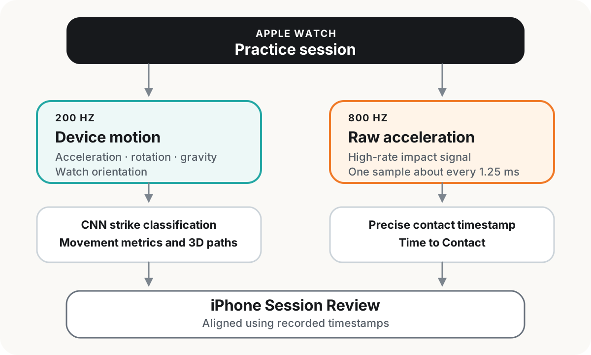
The Watch does not record everything at 800 Hz. Hz means the number of samples recorded each second. Each session contains two streams:
- Device motion at 200 Hz. This includes movement acceleration with gravity removed, wrist rotation, gravity, and Watch orientation.
- Raw acceleration at 800 Hz. This captures the short, sharp changes around contact.
The streams have different jobs. The CNN uses the 200 Hz data to find and classify strikes. A CNN is a small machine-learning model that learns patterns in a sequence of sensor readings. I also use this stream for movement measurements and the three-dimensional (3D) view.
The 800 Hz stream helps me place contact more precisely. It gives me about one acceleration reading every 1.25 milliseconds. I use that contact point when I calculate Time to Contact.
Both streams record the exact time of each sample. I use those times to line up the data. I do not assume that every 200 Hz sample has exactly four matching 800 Hz samples, because sensor delays and small gaps can happen.
I also stopped using CSV files, which store data as lines of plain text. Each session now uses two smaller binary files, which store the sensor values directly, and a metadata file with details about the recording. I keep the three files together in one .mmrec package. The package can move from the Watch to the iPhone, open in my analysis tool, and later be used to train another model.
My Series 6 cannot record this complete format. I chose not to create a slower fallback because I want all new sessions to contain the same type of data.
From One Strike Label to Five
The model from my earlier posts answered one question: strike or non-strike. That was enough to test detection, but it could not describe a full practice session.
The current model uses five labels, known as classes:
- Non-strike
- Regular dominant strike
- Non-dominant strike
- Ground strike
- Free-puck
I added them one step at a time. First, I trained the model on the new 200 Hz data. Then I separated dominant and non-dominant strikes. I added ground strikes and free-pucks after I had reviewed enough examples of each movement.
Free-pucks need more preparation before contact than a normal self-toss strike. The model now looks at 160 samples, which covers about 0.8 seconds. Most of that time comes before the point it is trying to classify, so the model can see more of the lift and preparation.
I tested the model on validation recordings. These are recordings that were not used to train it. This helps me check whether the model learned a useful pattern instead of remembering its training data.
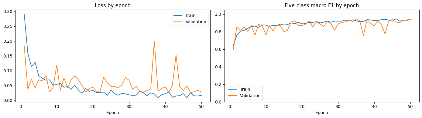
Fig 2 shows the latest training run. Loss, on the left, shows how far the predictions were from the correct answers. F1, on the right, combines two questions: how often a prediction was right, and how many real examples the model found. I use macro F1 because it gives equal weight to all five classes, even though some classes have much less data.
The validation F1 finishes above 0.9. It moves around more than the training score because the validation set is smaller.
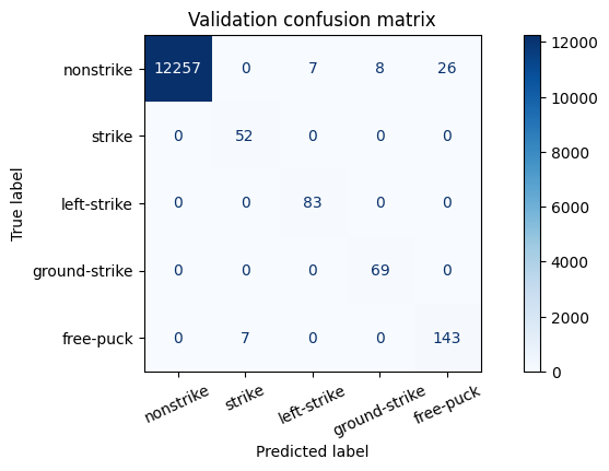
A confusion matrix compares the correct labels with the labels predicted by the model. Each number in this chart represents a short input window, not a whole strike. The model correctly classified all 52 regular-strike windows, 83 non-dominant windows, and 69 ground-strike windows. It classified 143 of 150 free-puck windows correctly and marked the other seven as regular strikes.
The same set contains more than 12,000 non-strike windows. That large background class would make a simple accuracy score look better than it really is. I care more about how the model handles the smaller strike classes.
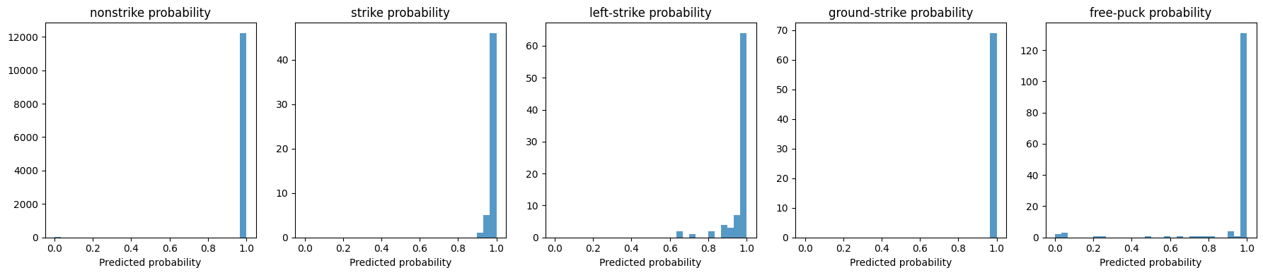
The next plots show how much confidence the model gave the correct class for each validation window. Most values are close to full confidence. The free-puck results are more spread out, which means some examples are still harder for the model to recognise.
I also tried two ideas that did not work as well. One model found strikes first and then tried to choose the type. Another version placed every training example around the exact moment of impact. Both versions often confused free-pucks with regular strikes, so I returned to the simpler five-class model.
The free-puck label still has a limit. It means the wrist movement looks like the lift-and-strike examples in my data. The Watch does not know whether the strike happened in a match or what was happening around the player.
Finding the Beginning of the Swing
The CNN finds the rough part of the recording that contains a strike. I then use the 800 Hz data to find contact more precisely. After that, I look backwards to find the start of the swing.
I often practise self-toss strikes. A small hand movement happens as I release the ball, followed by the main swing. The analyser looks for that last completed hand movement and uses its strongest acceleration point as the start.
Sometimes that point is not clear. In those cases, the analyser can use wrist rotation or the start of the main rise in acceleration. It also groups small aftershocks together so that a later wobble does not become the start by mistake.
Time to Contact is the time between the selected start and contact. It is only a timing measurement. It does not say whether the strike was good.
The raw-acceleration graph shows the two points used in this calculation: start and contact.
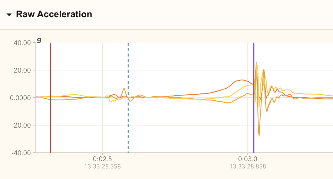
Ground strikes do not have the same self-toss movement at the start. I can often detect contact, but I cannot use the same rule to find when the swing began. Because of this, the app does not calculate Time to Contact or Projected Hand Speed, an estimate based on wrist acceleration, for ground strikes. It can still show Wrist Rotation Speed and Peak Jerk, which measures how quickly acceleration changes, around contact.
Turning Recordings Into Practice Sessions
Detection and measurements are not useful if the review process is awkward. I wanted the normal flow to stay simple:
- Start a session on the Watch.
- Practise and rate the latest strike.
- Stop the recording.
- Review the session on the iPhone.
The iPhone shows the detected attempts, my ratings, an optional note, summary measurements, charts, and estimated 3D paths. Ratings remain separate from the sensor data. They show my own view of the strike on a 0–10 scale.
A rating of zero can mark the latest attempt as a miss. Other ratings appear beside Time to Contact, Projected Hand Speed, or Wrist Rotation Speed. They do not change those measurements.
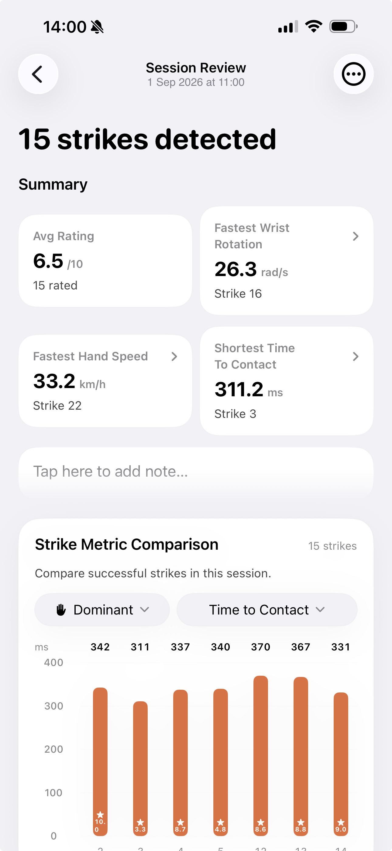
The screenshot says that the app found 15 strikes, but one card refers to Strike 22. The number follows the full list of attempts. That list also includes misses and uncertain attempts hidden from this view.
After removing contact quality, I did not want to create another score by accident. The comparison screen shows one measurement at a time. It uses the same style for every bar and does not mark a taller or shorter bar as better.
The app keeps dominant, non-dominant, and dominant free-puck attempts in separate groups. Their preparation and movement are different. It also leaves ground strikes out of comparisons that need a self-toss start.
Comparing the Shape of a Swing
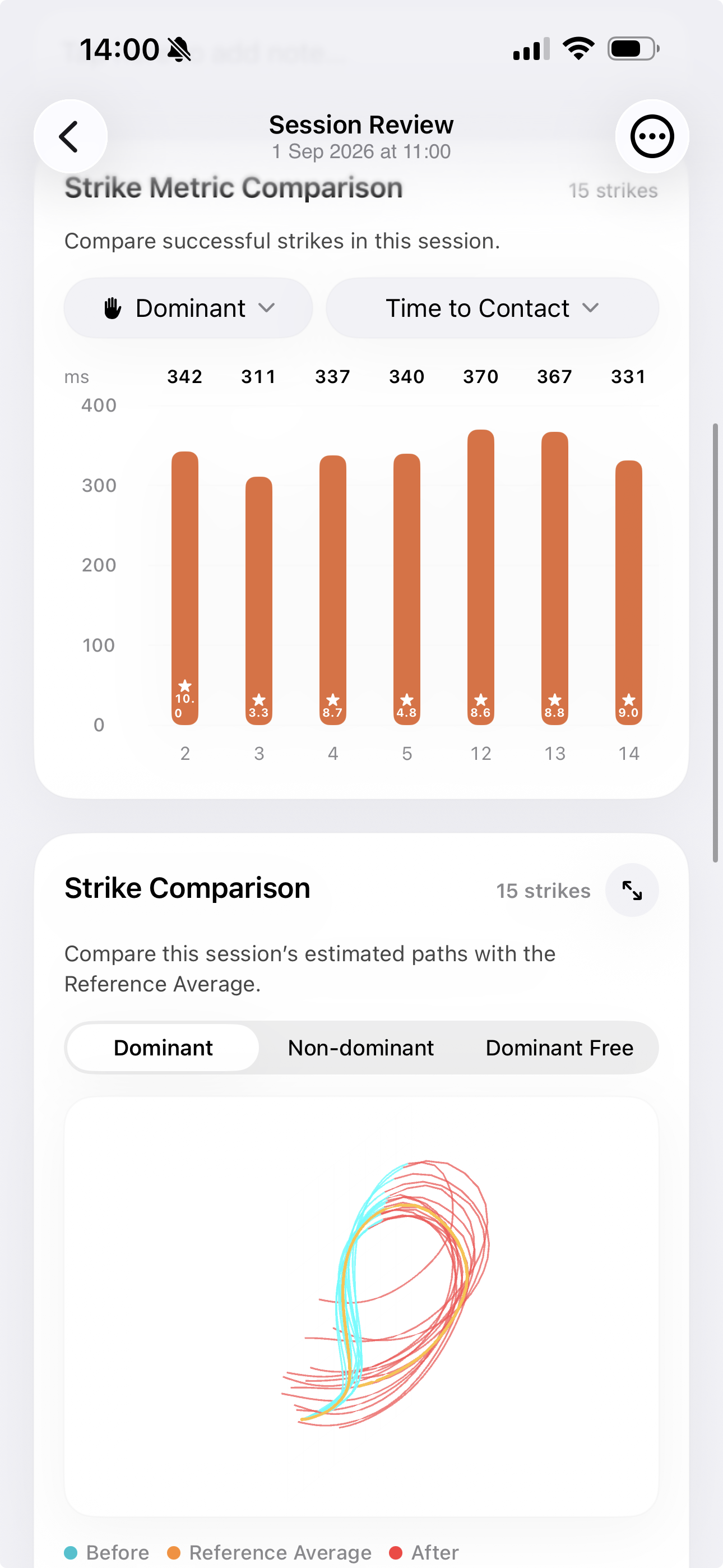
I wanted to continue the 3D work from Part 3. The challenge was that each reconstructed path started in a slightly different direction, which made several strikes hard to compare.
The analyser now moves each path to the same starting point. It lines up the main direction of movement before contact and picks a real strike near the middle of the group as a reference. It then rotates the other paths towards that strike.
The analyser does not mirror, resize, or stretch the paths. Real differences should still be visible after it lines them up. The result is only an estimate of Watch movement. It is not the measured path of the hand, hurley, or ball.
I can also save attempts as Reference Strikes. I choose these strikes myself; the app does not decide that they are the best. A few saved strikes in one group can form a Reference Average for later sessions.
The app keeps dominant, non-dominant, and dominant free-puck references separate. This works better for me than the old contact-quality score. I can compare a new session with examples that felt useful without claiming that they define a perfect strike.
Two Months of Personal Progress
The most satisfying part is not the model score. It is having enough history to see changes in my own practice.
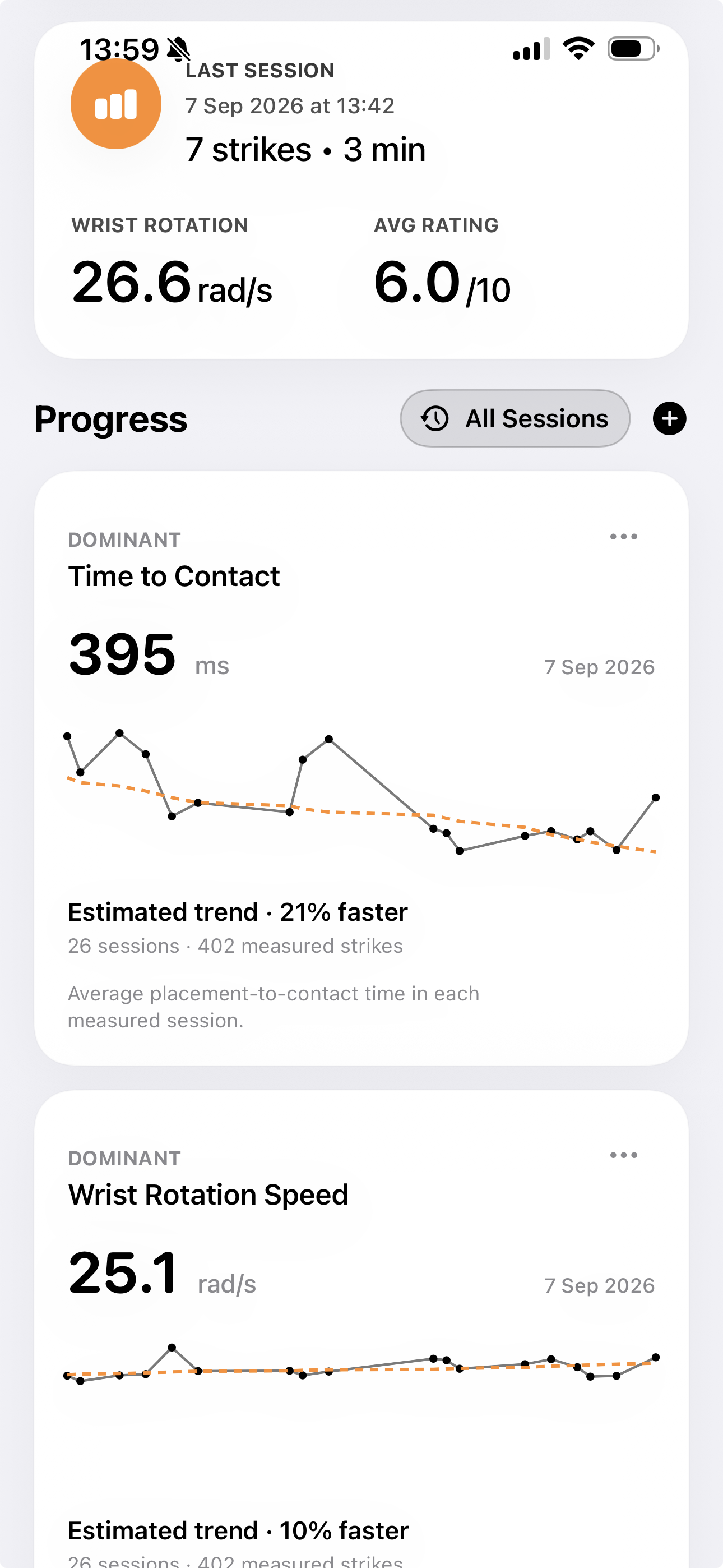
The Home screen has progress cards for Time to Contact, Projected Hand Speed, and Wrist Rotation Speed. Each point is the average from one session. Sessions from the same day share one point on the chart, but I can still open each session.
The large number is the latest session average. The dashed line shows the longer trend. The calculation gives less weight to one unusually high or low session, and it only appears after I have recorded enough data.
My charts now cover 26 sessions and 402 measured strikes over about two months. During that time, Time to Contact is estimated to be 21% faster. Wrist Rotation Speed is estimated to be 10% faster.
There is a simple feedback loop here. I needed more data for the app, so I kept going out to practise. As I practised more, I started to improve and the measurements began to change.
I can feel that my striking has improved, but these percentages do not measure my full hurling ability. They describe two signals from one sensor on my wrist. The Watch cannot judge my accuracy, technique, decisions, or how I play under pressure.
What the Watch Still Cannot Tell Me
The limits from Part 3 have not gone away.
Projected Hand Speed comes from adding up acceleration during a short part of the swing. It is useful for comparing similar recordings, but it is not the speed of the hurley or ball.
The 3D path can drift away from the real path over time. A Watch on the wrist also cannot track the full movement of the hurley. Peak Jerk, which measures how quickly acceleration changes, helps me find contact. However, the result also changes with the ball, grip, vibration, and point of contact.
No single measurement tells the full story. The project started as a strike detector and then briefly became an attempt to score strike quality. It now feels more useful as a training log.
The Series 11 gives me better data, but it still cannot tell me whether a strike was good. More samples do not answer that question. For now, I am happy for the app to measure a few things clearly and give me another reason to keep practising.
What Is Next
The next step is user testing. I plan to share the app through TestFlight, Apple’s service for testing apps before release. I will invite teammates and other interested people, then see how it works with different players and practice routines.
I also want to try add another recording mode. Training Mode would keep the current focus on individual strikes and session review. Play Mode would look at the whole match or training game. It could start by tracking time spent running or idle, followed by a small set of other session measurements. This is still an early idea. I have not decided which Play Mode measurements will be useful.