In the previous posts, I was mostly looking at one question: can I detect a hurling strike from Apple Watch IMU data?
It turns out that this is the easy part.
Detecting a strike is still not trivial, but the problem is at least narrow enough to make progress. I now have an algorithm that can detect strikes, and it can detect the obvious strong and weak examples. But the hard part is not detecting the strike itself. The hard part is making sense of the strike after it has been detected.
What does a good strike look like in the data?
That question is much harder than I expected. And the question I probably don’t need to answer myself or indicate in anyway to user.
The difficult part is that strength and speed do not always map cleanly to quality. A faster strike is not always a better strike. A slower strike is not always bad. But for this early version, speed is one of the least confusing signals I have.
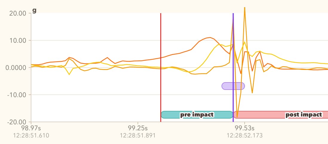
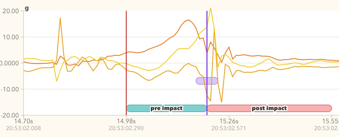
Earlier, I was looking at jerk as one of the main contributing factors. Jerk is the change in acceleration, and it can show a sharp impact when the hurl contacts the ball.
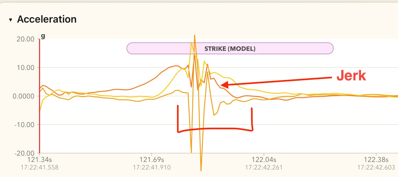
At first, I treated higher jerk as a sign of a better strike. But I no longer think that is generally true.
A strike can be powerful and still look less jerky in the data. If the player powers through the ball, has a strong grip, and keeps a good posture, the contact can produce less vibration through the hand and forearm. In that case, the acceleration graph may look cleaner, not more violent.
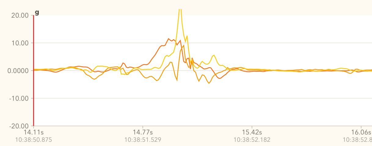
Equipment also matters. A softer ball may create less jerk. A harder ball may create a sharper spike because the wood vibrates more heavily. So jerk can sometimes tell me that contact happened, but it is not a simple quality score.
This is one of the traps I fell into.
The Contact Quality Experiment
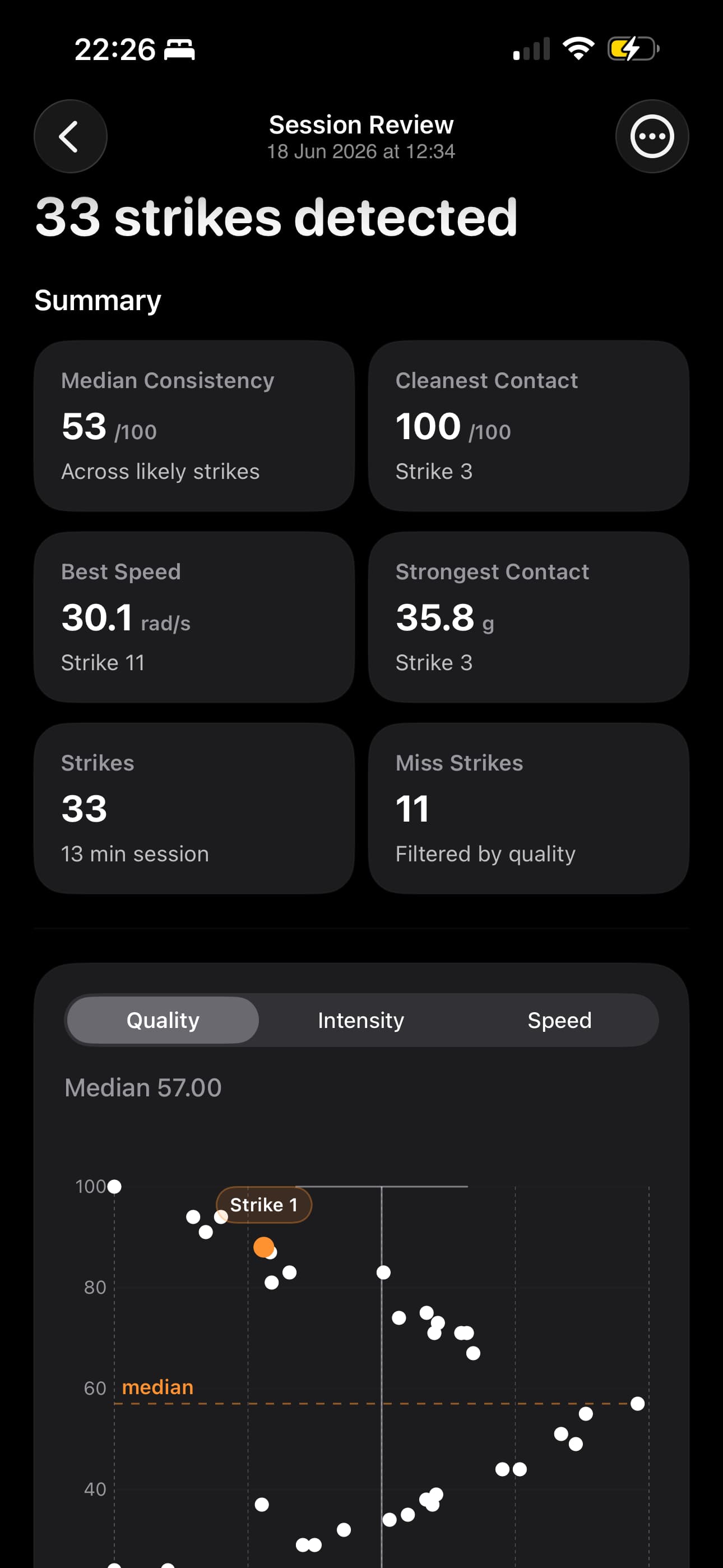
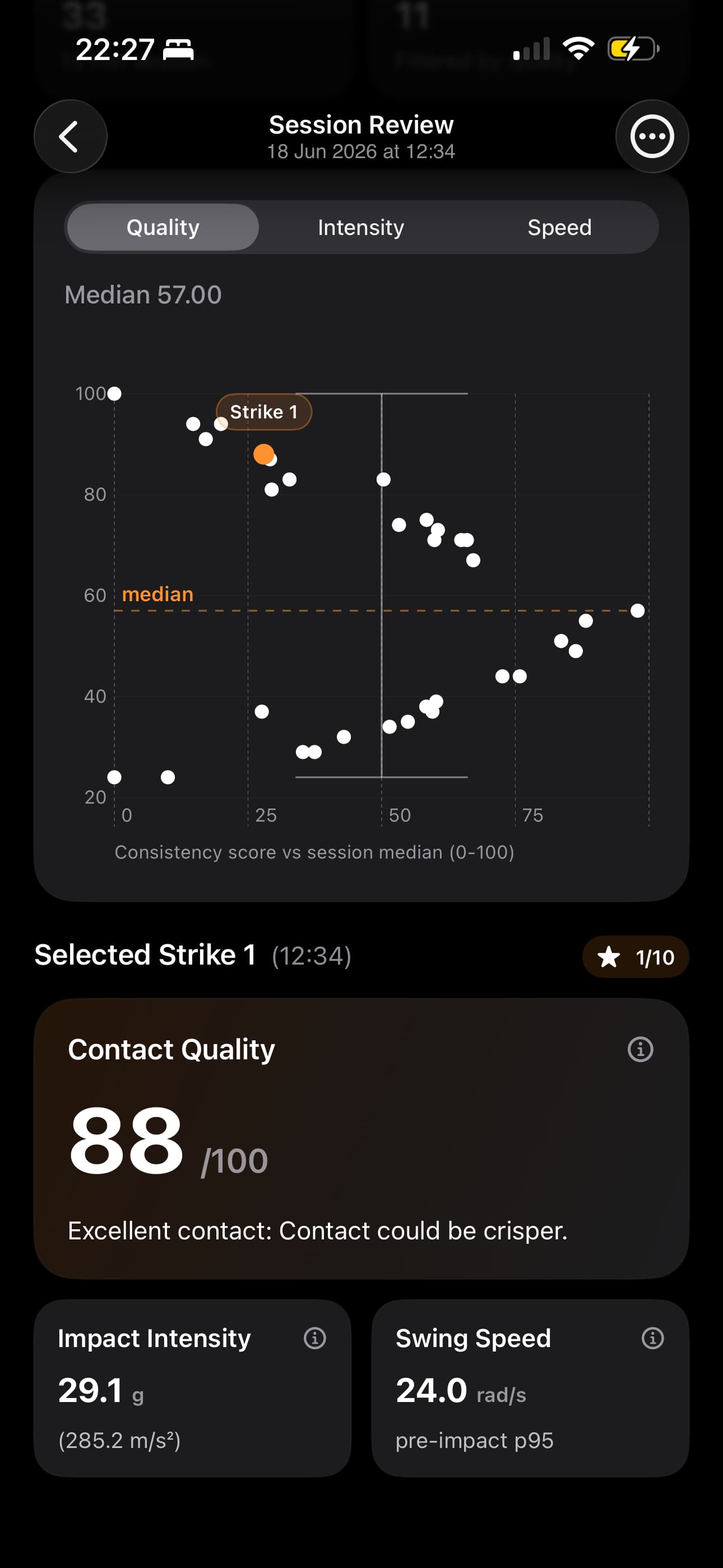
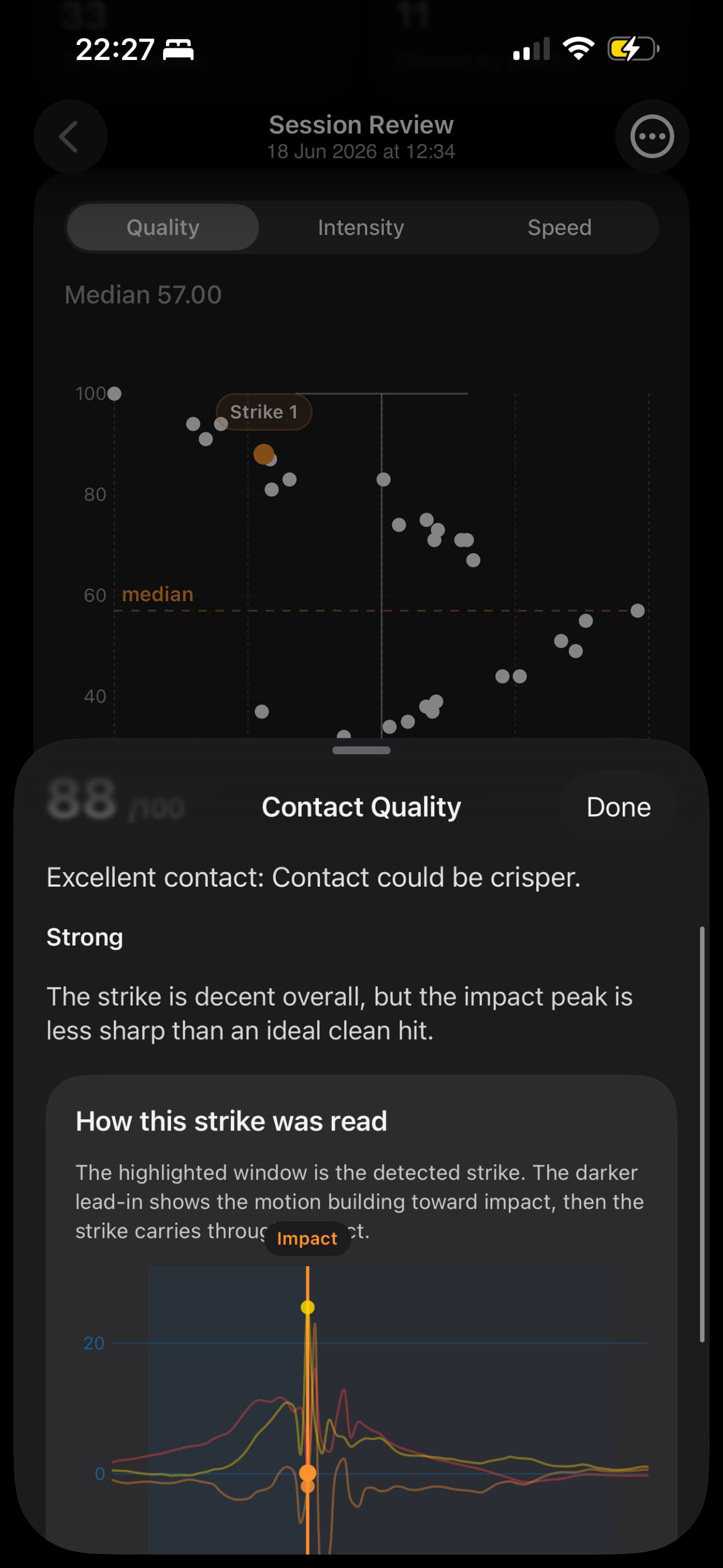
I built a prototype that calculated something I called contact quality. It looked nice in the app. The idea was to place each strike on a graph and compare quality against speed.
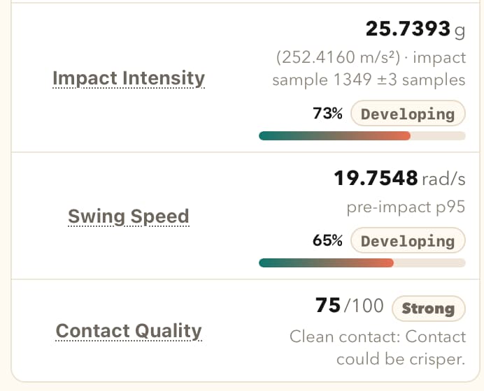
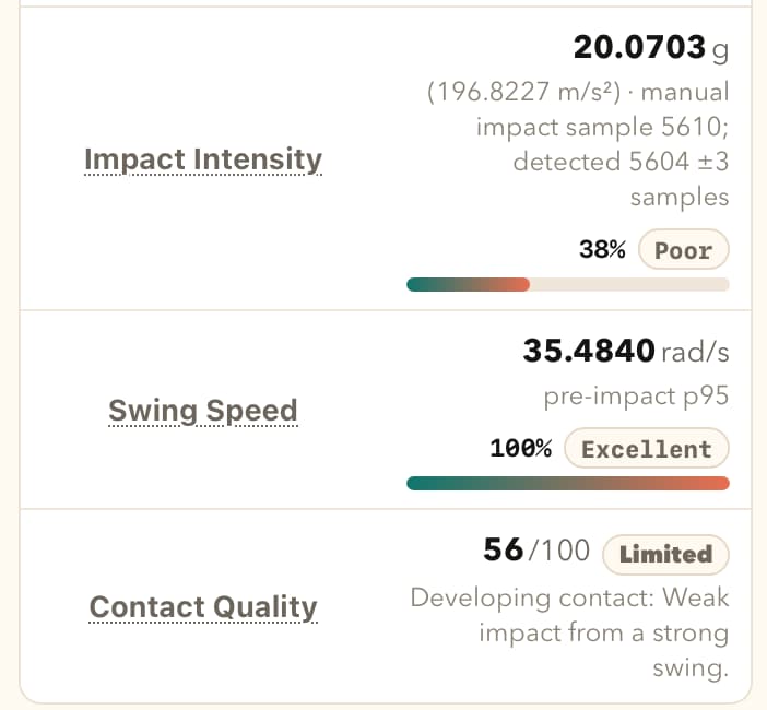
The session review showed a summary at the top, then a graph for the selected metric. From there, I could tap into a strike and see contact quality, impact intensity, and swing speed together.
I also had another metric called intensity. Intensity was mostly calculated from how jerky the strike was, which I now think was the wrong direction.
The app looked neat, and the graphs felt useful at first. But the more I tested it, the less confident I became.
I was using LLMs heavily while developing the formula. That helped me move quickly, but it also pushed me in the wrong direction. The formula slowly became tuned around my own strikes. In practice, it was not measuring contact quality as much as it was measuring how similar a strike was to the way I strike the ball.
Because I was the main source of test data, the formula was adjusted until my strikes looked good, but not necessarily right. My strikes were showing 80, 90, even 100 percent contact quality. Then I tested the prototype with a few teammates. I asked them to strike with my watch on their hand.
Their strikes were often shown as around 50% contact quality.
That was obviously wrong.
These players are more experienced than me. Their strikes are stronger and faster. The app itself was showing that their hand speed was much higher than mine. I had data from four different people to compare, and the speed difference was clear.
So the contact quality score was not trustworthy.
The most interesting part was not the score. The most interesting part was seeing how different the graphs looked between players. There is useful information there, but I do not yet know how to turn that information into a fair quality judgement.
Pulling Back
For now, I have decided to remove contact quality.
I have also removed intensity.
Those metrics were making judgement calls that I cannot properly defend yet. With only one sensor on the wrist, it is hard to say whether a strike was genuinely good or bad. I can detect that a strike happened, and I can often detect where contact happened, but I cannot honestly say that the app understands contact quality.
The next version of the app will show more raw data and fewer conclusions. It will avoid saying whether a strike was good or bad. It will avoid telling the player what they need to change. At this point, I do not have enough experience myself, and I do not have enough validated data, to make those claims.
Instead of the app trying to calculate contact quality by itself, I am adding the ability for the player to rate their own strike. I already coded a new version where the player can rate a strike from 1 to 10, including decimal values like 7.5.
The flow is intentionally quick. The player strikes the ball, then immediately rates it. The app does not ask, “here is a strike, please rate it.” The rating just applies to the most recent detected strike. If the player rates again, it updates the rating for that same last strike rather than creating a second rating.
This feels like a better direction for now. The app can collect what the player felt about the strike, and then I can compare that rating against the sensor data. Maybe later I can bring back a graph where the X axis is the player’s rating and the Y axis is speed, or another metric that turns out to be trustworthy.
What I Learned From This
The past month has mostly been about understanding what went wrong.
One lesson is that AI can help build things very quickly, but it can also make a weak idea feel more solid than it is. I was chatting with LLMs, asking what formulas could be applied, researching adjacent sports like tennis and golf, and slowly growing the contact quality metric from there.
But hurling has its own shape. The motion is different. The equipment is different. The contact is different. And I only have one sensor, on the wrist.
That makes the problem much harder.
Another lesson is that I need more data from other players. Testing with teammates immediately exposed the bias in my formula. The prototype was not general enough. It was too closely fitted to me.
I should have started testing with other people sooner.
What Is Happening Now
Even though I am removing the quality score and moving that judgement to the user with “rate your strike”, this is still positive progress.
I am learning more about the mechanics of striking. One of my teammates showed me how to strike better, and I can feel myself improving. That is funny in a nice way: while trying to build an app for hurling, I am also getting better at striking.
I have made more progress on visualising the movement in 3D space again. That feels like the right direction.
This version shows the movement trajectory in 3D space. Small moving box travelling along the path, with X, Y, and Z arrows pointing in the correct directions as Watch was pointing. We also have point where the strike happened, so the impact is shown directly on the trajectory instead of only as a spike on a graph.
The trajectory is still estimated data, and it has drift because there is no sensor fusion. Even with that limitation, it gives a much better sense of what is going on: how the hand moved, where the swing changed direction, and where the contact happened. I will continue to iterate on the visual.
The app is coming together nicely, and the next user testing is soon..