In the first post, I looked at the raw Apple Watch IMU data and found a visible pattern around successful air strikes. This post takes the next step: turn those recordings into labeled training data and see whether a small CNN can detect strikes automatically.
The aerial strike is the highest occurring skill. Jab lift is the most prominent method for possession gain. Taking steps most common method of travel. Non occurrence of ground hook was observed. Prevention of jab lift could reduce opponents in possession striking by 44.67% This method of striking accounts for 77.8% of all in play striking meaning a significant impact could be made. [1]
That makes air strike detection a useful first target: common enough to matter, narrow enough to model as a binary question. With the basics understood and enough recordings collected, I moved on to labeling data and training a simple model to answer one question: strike or not strike.
To train a CNN, some clean data is required to start the process. As many say, good data in, good data out. In my case I use my imu-analysis-tool to label data. It was mentioned in the first post of the series as a visualiser tool, but it became just as important for iterating on labels as for inspecting the raw sensor traces.
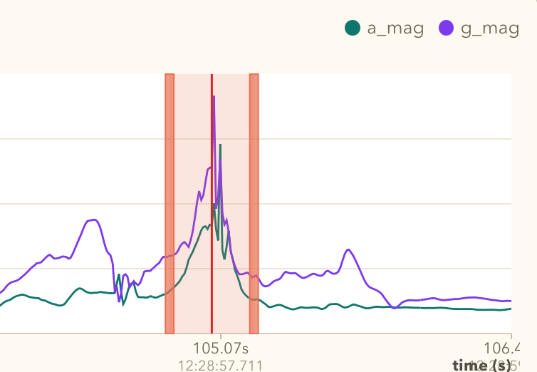
After some trial and error labeling data multiple times, it became evident that labeling and inspection of data is probably 80% of the job. To get to the current labeling approach, the analyser tool went through multiple iterations of changes, and without coding tools it would probably have taken a lot longer to get to the point where it is now. For the first somewhat successful version, the label was placed on the strike so that the playback indicator sat on the highest spike in gyroscope magnitude, then I took 20 samples both ways out of the middle. This created a window of 41 samples.
Interestingly enough, the first samples were collected at 50Hz from Apple Watch and were still good enough to train a useful model. That early model was capable enough to recognise strikes even on 100Hz data. Likely 50Hz was already sufficient to capture the important motion pattern, and adding acceleration and gyroscope magnitude features also made a significant improvement in those early experiments.
Later, I interpolated some of the 50Hz recordings to 100Hz and mixed them with newly recorded native 100Hz data. That got the project moving, but it also introduced inconsistency into the training pool. Eventually I removed a few of those interpolated recordings, because they made validation harder to interpret. The smaller dataset turned out to be cleaner and more precise.
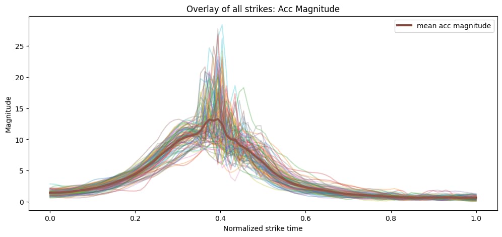
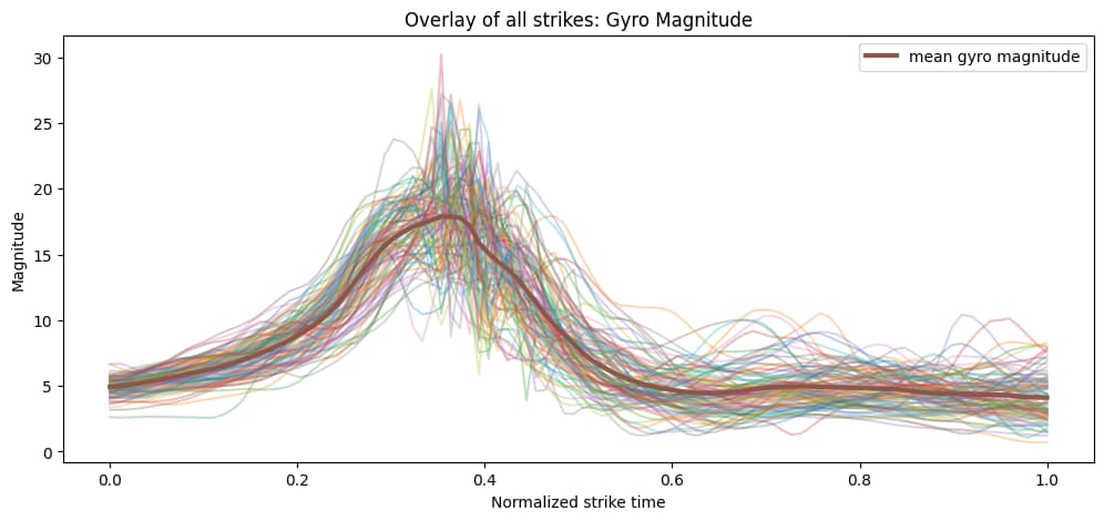
Figures 2 and 3 show the average pattern across the labeled strike segments.
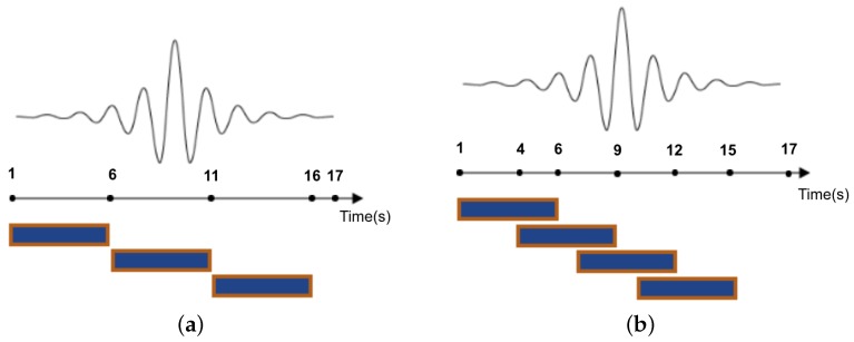
Instead of training on the raw continuous recording, the sensor stream was split into fixed-length sliding windows. Each window became one model input, giving the network a consistent input shape and letting it learn short motion patterns associated with strikes. Overlapping windows also meant the same strike could appear in slightly different positions within the window, which helped robustness.
“The sliding window approach, hereafter referred to as ‘windowing’, is the most widely employed segmentation technique in activity recognition.” [2]
The first labeled dataset was built at 50Hz. At that stage, a strike label covered about 40 samples, with another 20 samples of padding after the strike. That put the label itself at roughly 0.8s, while the full window ended up at 70 samples, or about 1.4s. That setup was not especially deliberate at first, but it worked well enough to get training started.
After moving to 100Hz, the same time span would have required roughly doubling those sample counts, so label size and padding became worth revisiting properly. Because the labels were anchored around the centre of the strike, it was easy to scale them up and down with a small helper script and test different combinations. The current setup settled on:
40samples for the strike label20samples of end padding60samples per window- stride
8
After windowing, the dataset still contained far more negative windows than positive ones, largely because the recordings included idling and other non-strike activity between strikes.
Positive windows: 616
Negative windows: 20465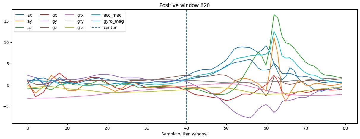
For training, those windows were grouped into mini-batches of 64 samples. The class imbalance was still significant, so the loss function was weighted to penalise missed strikes much more heavily than background errors. For this run, the positive-class weight came out at roughly 33.0.
Because of that imbalance, plain accuracy is not the most useful metric to watch. A model can achieve high accuracy simply by predicting notstrike most of the time. The more interesting metric here is F1, which combines precision and recall into a single score. Precision answers “when the model says strike, how often is it right?”, while recall answers “of all real strikes, how many did it catch?”. F1 balances those two, so it is a much better way to judge whether the model is actually learning to detect strikes rather than just exploiting the majority class.
As for model design, the model itself stayed intentionally small. Input to the network was a normalized 60 x 11 window, where 11 channels came from raw acceleration and gyroscope axes plus derived magnitude features. The CNN had three temporal convolution blocks:
Conv1d(11 -> 32, kernel_size=5)+BatchNorm1d+ReLU+MaxPool1d(2)Conv1d(32 -> 64, kernel_size=5)+BatchNorm1d+ReLU+MaxPool1d(2)Conv1d(64 -> 128, kernel_size=3)+BatchNorm1d+ReLU
After that, an AdaptiveAvgPool1d(1) compressed the temporal dimension, and the classifier head used:
Linear(128 -> 64)+ReLU+Dropout(0.3)Linear(64 -> 1)
That architecture was simple on purpose. I did not want a huge network; I wanted something that could learn short motion patterns, train locally on a laptop, and still be small enough to export later.
This version of the pipeline also used a more trustworthy validation split. Instead of randomly mixing windows from the same recording into both train and validation sets, the split was done by source_id, meaning entire recordings were held out. In total, 12 sources were used for training and 4 were held out for validation.
Train batches: 180
Val batches: 150
That is a much better test of generalisation, because the model has to deal with unseen recordings rather than slightly shifted versions of windows it has already seen.
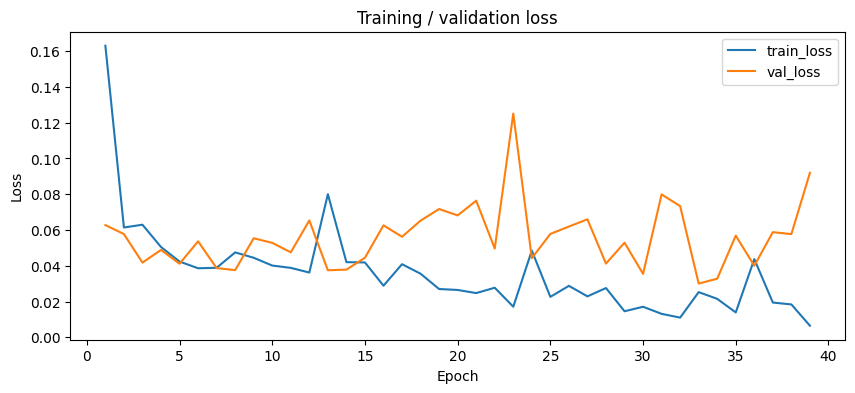
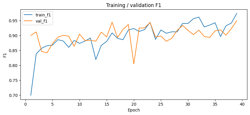
With the cleaner dataset and grouped validation split, the training behaviour looked much healthier. The model still learned quickly, but this time validation stayed strong instead of drifting away from training.
Epoch 01 | train_loss=0.1630 train_f1=0.6993 val_loss=0.0627 val_f1=0.9002 val_precision=0.8258 val_recall=0.9892
Epoch 02 | train_loss=0.0614 train_f1=0.8383 val_loss=0.0577 val_f1=0.9118 val_precision=0.8483 val_recall=0.9856
Epoch 03 | train_loss=0.0629 train_f1=0.8571 val_loss=0.0418 val_f1=0.8463 val_precision=0.7335 val_recall=1.0000
...
Epoch 35 | train_loss=0.0139 train_f1=0.9428 val_loss=0.0568 val_f1=0.9154 val_precision=0.8492 val_recall=0.9928
Epoch 36 | train_loss=0.0437 train_f1=0.8963 val_loss=0.0400 val_f1=0.9187 val_precision=0.8523 val_recall=0.9964
Epoch 37 | train_loss=0.0194 train_f1=0.9324 val_loss=0.0588 val_f1=0.9008 val_precision=0.8220 val_recall=0.9964
Epoch 38 | train_loss=0.0184 train_f1=0.9415 val_loss=0.0577 val_f1=0.9231 val_precision=0.8625 val_recall=0.9928
Epoch 39 | train_loss=0.0065 train_f1=0.9741 val_loss=0.0919 val_f1=0.9497 val_precision=0.9164 val_recall=0.9856
Early stopping: train loss below threshold
The best held-out validation F1 for this run was 0.9497, which was a much more interesting result than the earlier runs that still mixed in more interpolated data.
The updated curves show a cleaner story as well. Training loss drops steadily, while validation loss stays low for most of the run. The F1 curves are even more useful here: training and validation remain much closer to each other, which is a good sign that the model is learning a genuine strike pattern instead of just memorising the training set.
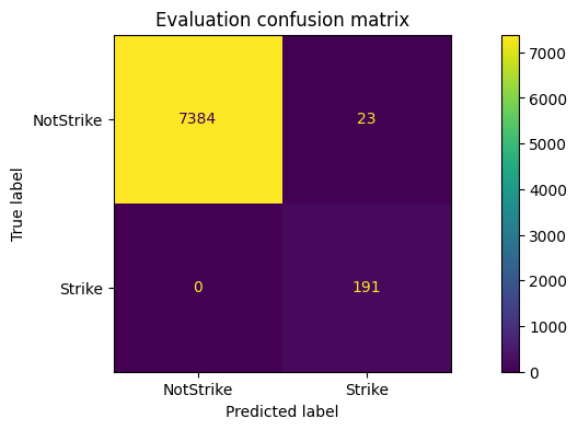
On the held-out validation recordings, the final classification report looked like this:
              precision    recall  f1-score   support

   notstrike       1.00      1.00      1.00      9304
      strike       0.92      0.99      0.95       278

    accuracy                           1.00      9582
   macro avg       0.96      0.99      0.97      9582
weighted avg       1.00      1.00      1.00      9582
The most important number for me there is not overall accuracy, because the dataset is extremely imbalanced. The more useful signal is that strike precision stayed above 0.91, recall was almost 0.99, and the strike-class F1 landed around 0.95 on recordings the network had not seen during training.
The evaluation looks promising, but some notstrike windows are still being classified as strike. A likely reason is that the recordings include full swings that miss the ball. From the sensor point of view, those motions can still look very similar to real strikes. In the app, those may later be filtered with additional heuristics such as peak jerk detection, but ideally they should become a separate labeled class in the dataset.
Things to improve in the future:
- add more labeled data
- add more varied data from different sessions, tempos, and players
- add a separate class for air strikes where the ball is missed
- add another class for smaller strikes, such as wall strikes or short passes
- compare native 100Hz recordings against interpolated 50Hz data and likely drop the weaker option
- experiment further with window size, stride, and decision threshold
- add post-processing to merge neighbouring positive windows into a single strike event
For now, this is good enough to move from offline experiments into the iOS companion app. A strike-class F1 around 0.95 on held-out recordings is not a finished product, but it is strong enough to test live detection, tune thresholds, and start turning model output into useful hurling metrics.
The next step is getting the model into the iOS app and seeing how it behaves outside the notebook.
- Gilmore, Hugh. (2008). The craft of the Caman; A notational analysis of the frequency occurrence of skills used in Hurling. International Journal of Performance Analysis in Sport. 8. 68-75. 10.1080/24748668.2008.11868423.
- Banos, Oresti, et al. (2014). Window Size Impact in Human Activity Recognition. Sensors, 14(4), 6474-6499.